")
Here are some things you told us you wanted, that we did:


Here are some things you wanted that we couldn’t do:


Here are some changes we made after doing “user testing” with young people:
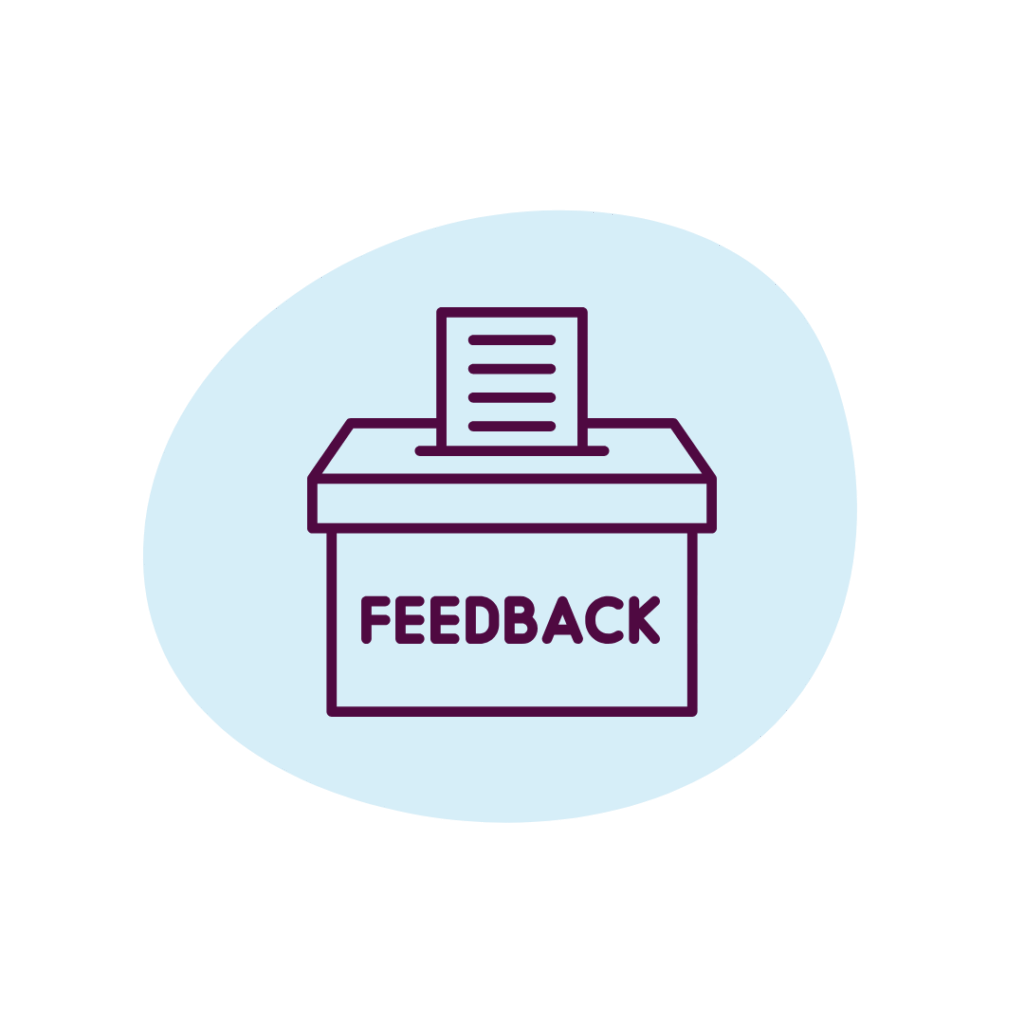
If you have any more feedback you want to share, contact us.
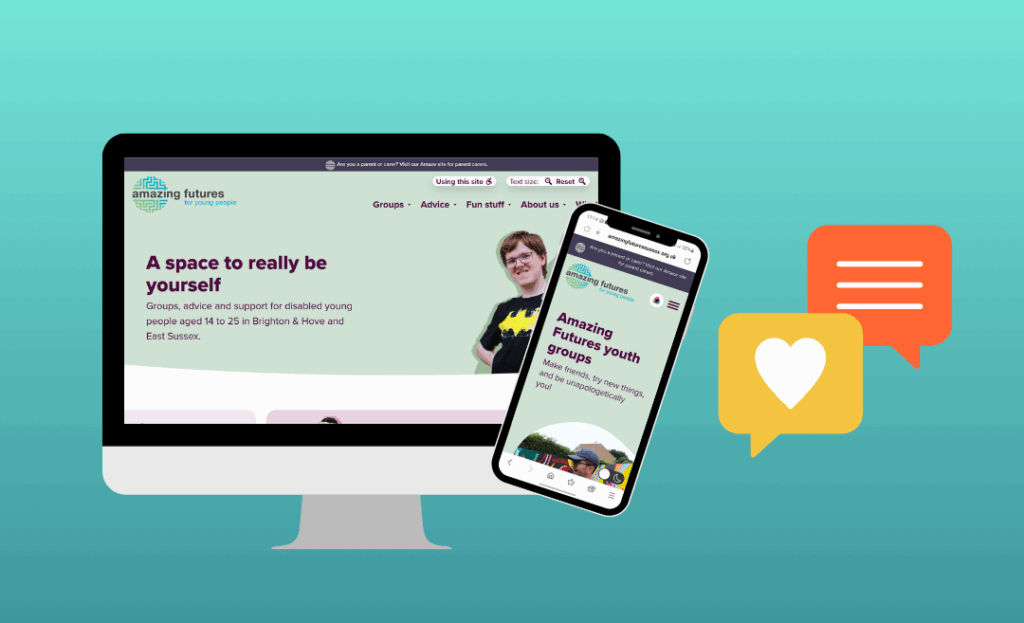
Over the past year and a half we have been working with you to create this Amazing Futures website, which has now officially launched! Read on to learn how your feedback has guided our decisions.
Disabled and neurodivergent young people have been involved the whole way through this process:
 You told us what you wanted and needed from the website to help us plan it
- You gave us feedback on designs for different pages
- You voted on decisions like which design and colour scheme to use
- You helped us “user test” the website once it was built, to get it ready for the official launch
Here’s what you told us, and what we did as a result:
Click to show more information 
Accessibility
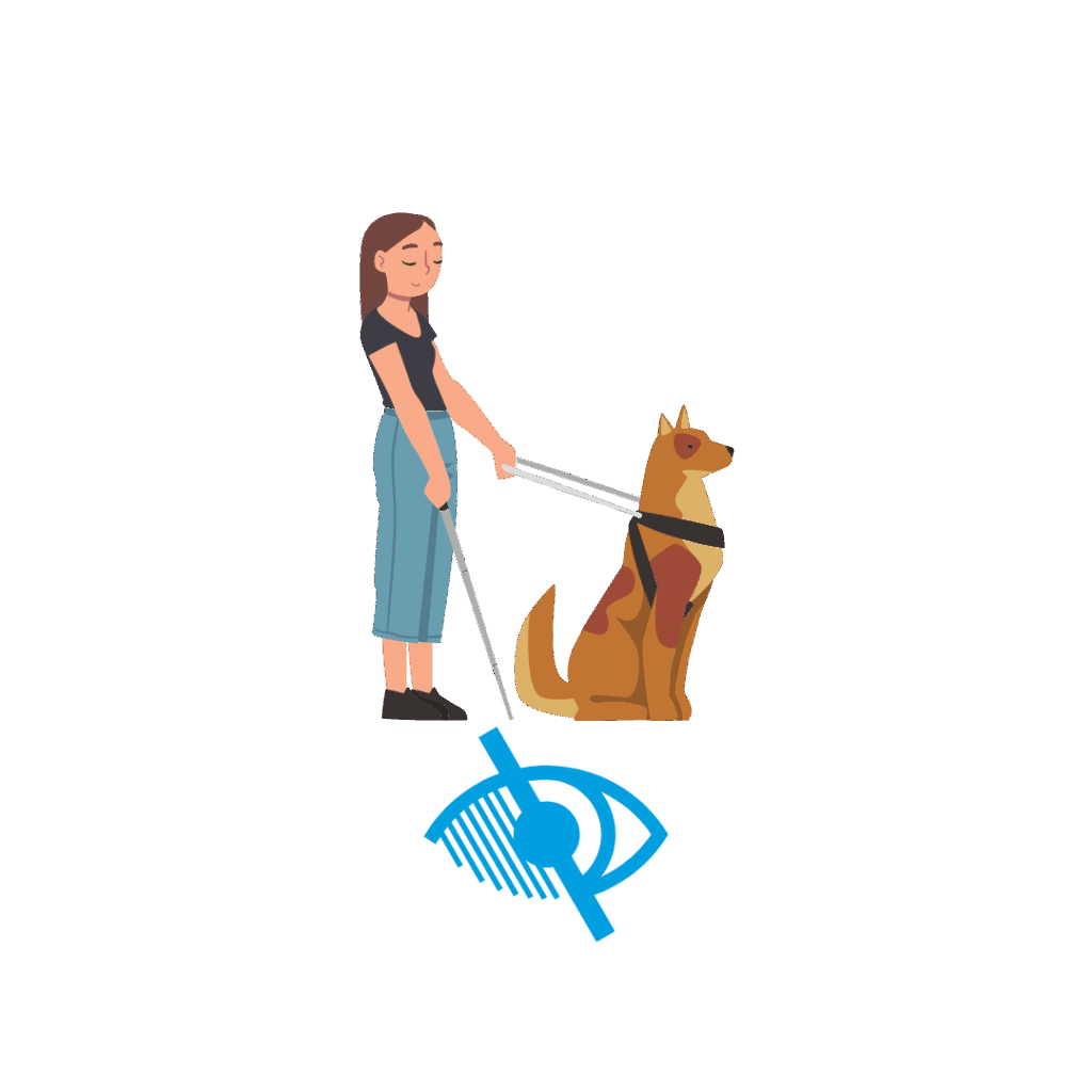
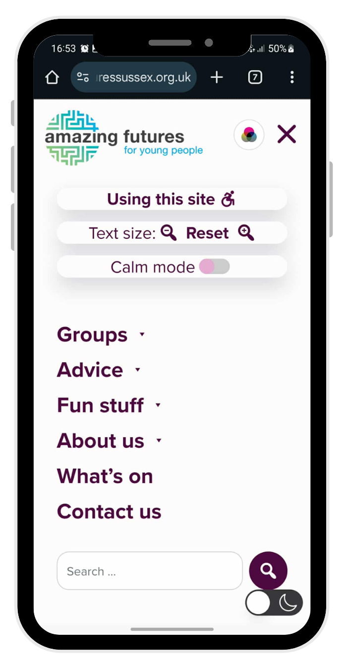
You told us you wanted the website to have lots of accessibility features.
 The website has:
✔️ ability to view most pages as Easy Read
✔️ relaxed colour mode
✔️ dark mode
✔️ large text
✔️ text size controls
We also are planning to create more videos over the next year.
We weren’t able to include:
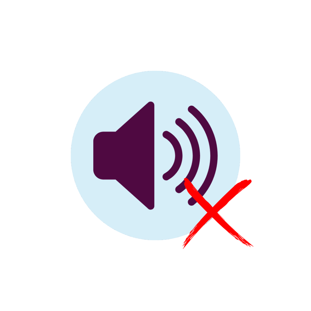
❌ buttons to read out text – we trialled this but it wasn’t accessible for screen readers, and it made the website look cluttered and overwhelming
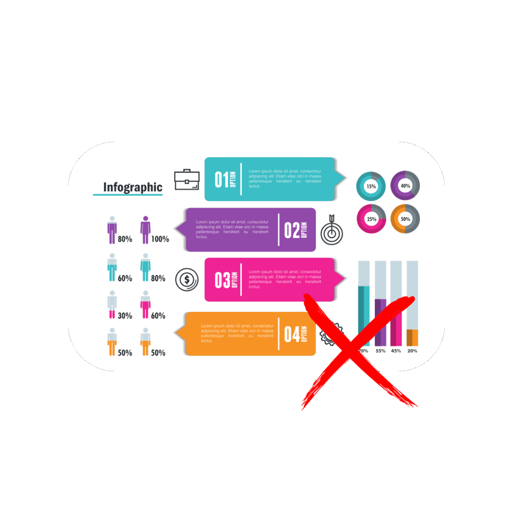
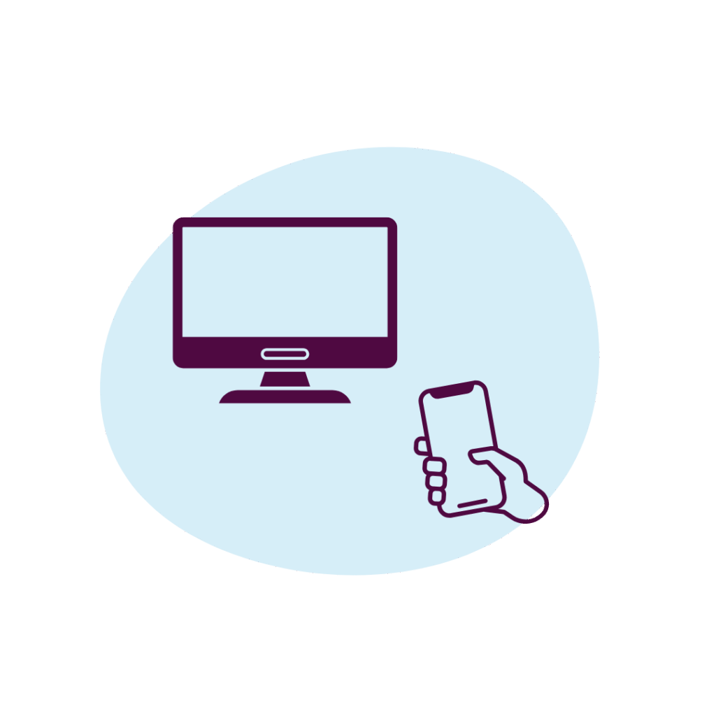
❌ infographics – couldn’t get them to work well on both mobile and PC, and they also aren’t very accessible to screen reader users
Look and feel
 You told us you wanted:
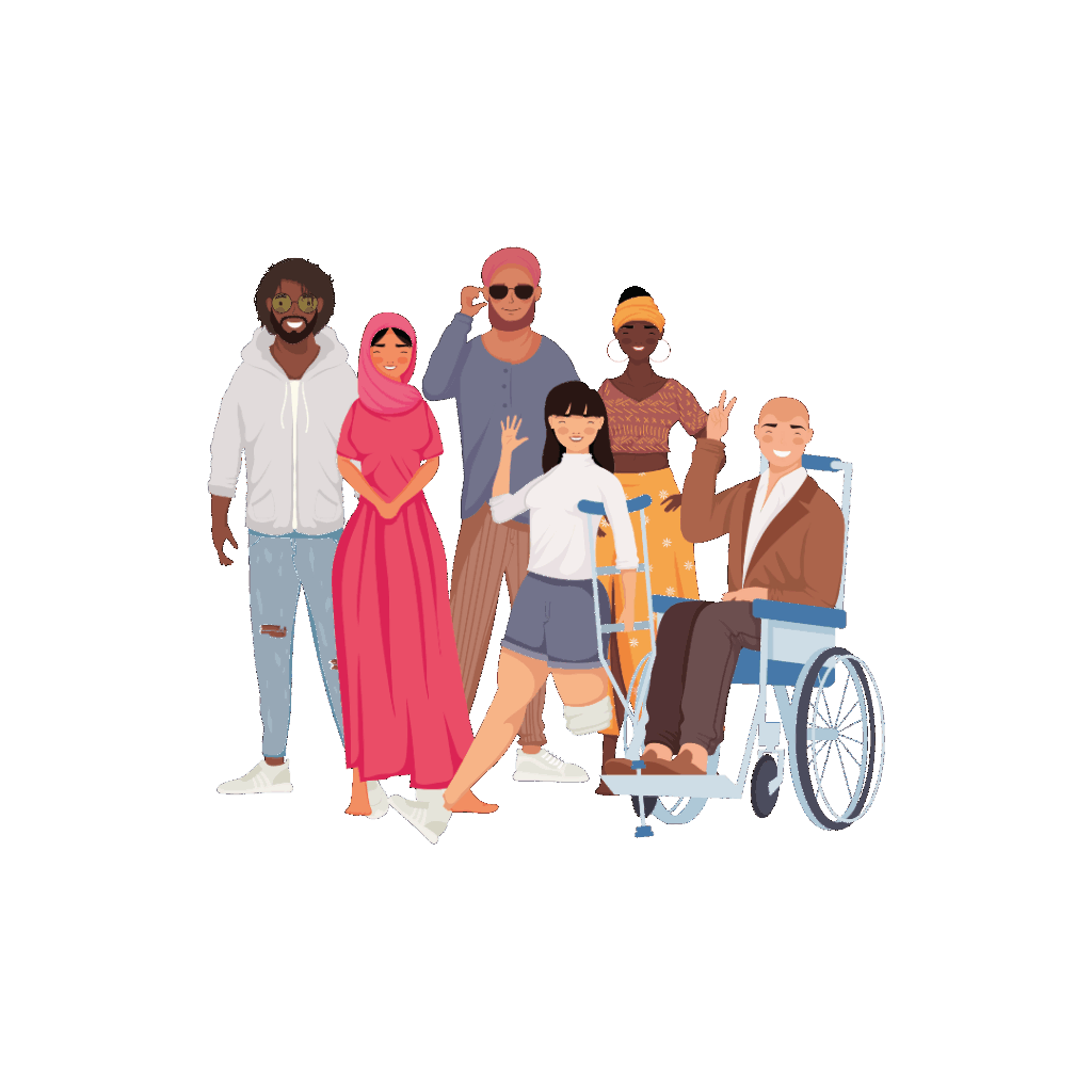
- a simple, bold and colourful design, in muted shades
- lots of photos and graphics, including lots of diversity
- lots of art by young people
- less text
- an empowering tone aimed at young people not parents
- less stock images
What we did:
✔️ created different designs and colour schemes and invited young people to vote on their favourite
✔️ used lots of images, including as much diversity as possible in gender, ethnicity, disability, LGBTQIA+ and subculture – although in some cases we have been limited by what’s available
✔️ created a gallery for your art
✔️ used much less text than on the Amaze parent website, and provided Easy Read versions of pages that have even less text
✔️ checked with young people that they were happy with the tone
✔️ paid a photographer to take photos at our youth groups, and used these as well as graphics instead of stock photos wherever possible
What's on the website
 You told us you wanted:
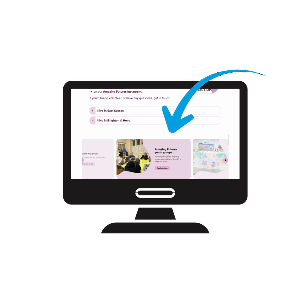
✔️ SEND advice and information (the most popular topics were mental health and housing)
✔️ information about Amazing Futures groups and services
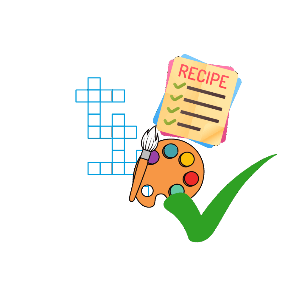
✔️ fun things like quizzes, recipes, reviews and art by young people
✔️ information about staff and volunteers, and group venues
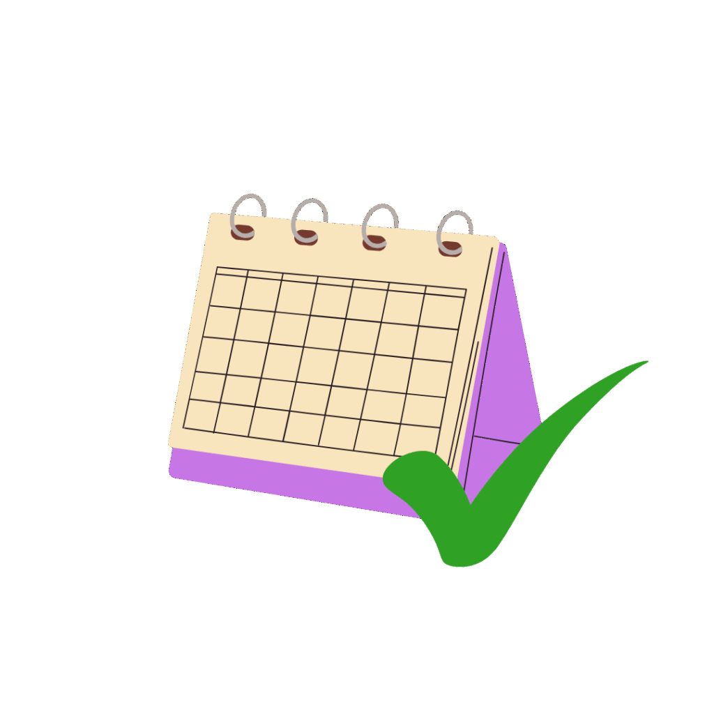
✔️ a calendar of events
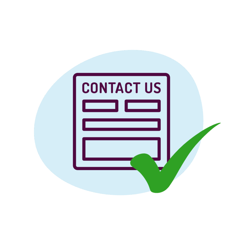
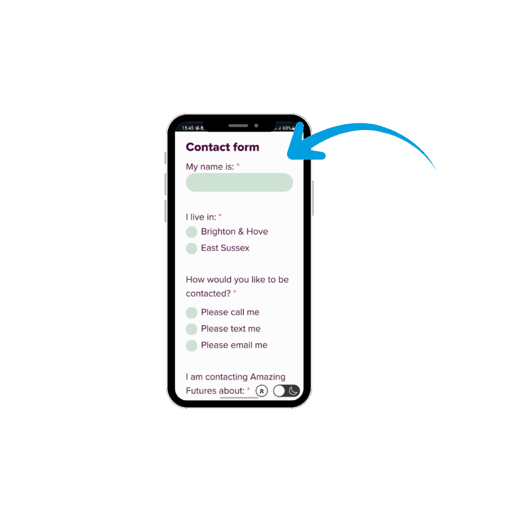
✔️ a simple contact form
✔️ news posts
The website has all these things.
You also asked for:
❌ buttons to register interest in possible groups and workshops – we considered this but decided Instagram polls and polls at groups would be a better way to do this
❌ an online shop – we researched this, and it would have been expensive and difficult to do, and it would be better to use other websites like Redbubble or Etsy if we decide to sell things in the future
❌ a space to chat and make friends – this would have been expensive to develop, hard to keep safe for young people, and there are other ways to do this better, eg WhatsApp
User testing
 We got your help to test how easy you found the website to use, and then made changes based on what we learned:
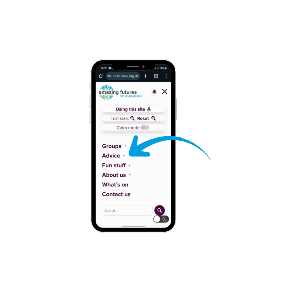
- we changed the menu to make it easier to find the SEND advice and information
- we removed the “related pages” section at the bottom of pages as it was confusing people
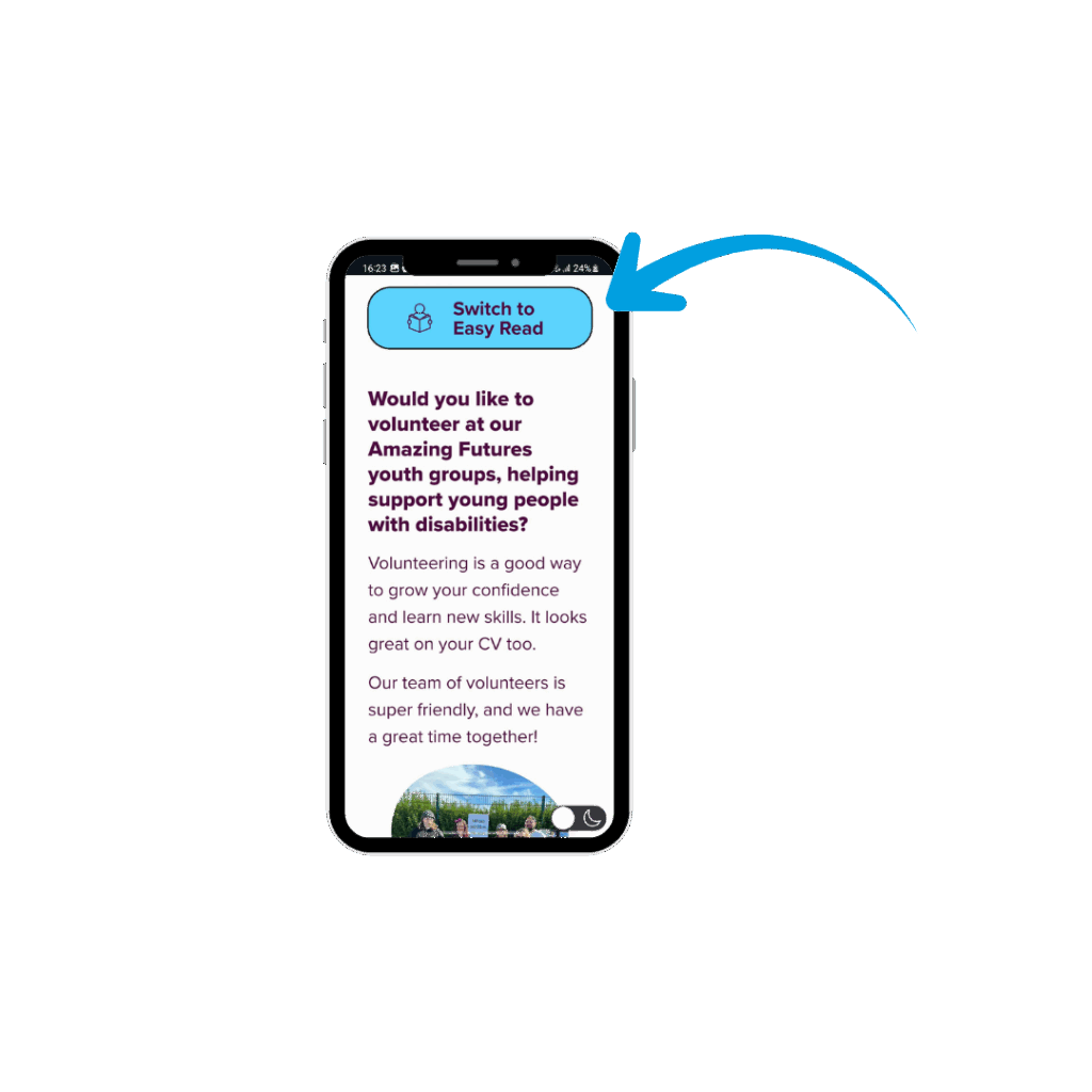
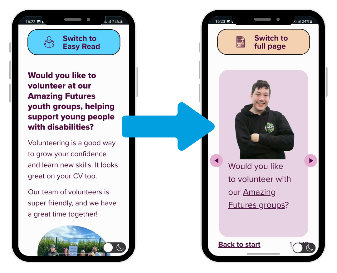
- we changed it so pages load as the full version with a button saying “Switch to Easy Read” with the Easy Read icon, rather than loading as Easy Read first with a toggle, as people found this confusing
- we made the contact form simpler and all one page
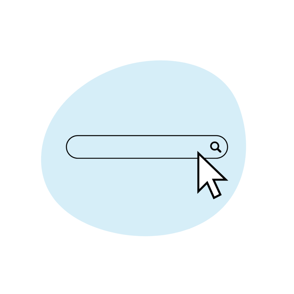
- we improved the search function so you get more relevant results
We hope you’re happy with how it’s turned out!
This is your website, created with your help and guidance, for you to use.
If you have any feedback, or want to send us something to share on the site (your art, recipes, blog posts, quizzes…), please fill out the contact form.